Design is more than just aesthetics. It’s about how your product functions, feels, and guides users.
SaaS users expect speed, clarity, and results the moment they log in. A confusing interface can drive them away before they experience your product’s value. On the other hand, a simple, easy-to-use design instills confidence, control, and a sense of being cared for.
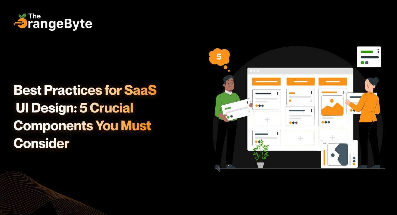
Here are five essential UI design components that enhance usability and user satisfaction.
1. Strong Visual Hierarchy
The most important elements should stand out immediately. A clear visual hierarchy guides the user’s attention from primary to secondary elements.
It’s not just about fonts or colors. Layout, spacing, grouping, and contrast all work together to make information digestible and actions intuitive.
Example: On an analytics dashboard, if everything demands attention, nothing stands out. But when primary actions are highlighted, secondary information is subtly placed beneath, and filters are off to the side, users can act confidently without hesitation.
Quick Tips:
- Make primary buttons prominent in size and weight.
- Group related items visually with cards, modules, or color blocks.
- Keep content concise and scannable.
2. Intuitive Navigation
Users won’t wait to figure out where to click. Navigation should feel natural and predictable. Whether it’s tabs, sidebars, dropdowns, or breadcrumbs, users should find what they need quickly.
Tips:
- Keep navigation consistent across the platform.
- Use familiar icons and clear terminology.
- Keep menu depth shallow for easier scanning.
- Highlight the current section.
- Ensure every click and scroll has a purpose.
3. Responsive and Adaptive Design
Your users are on desktops, phones, tablets, large monitors, and even foldable devices. Your UI must work seamlessly across all.
- Responsive design adjusts layouts to fit the screen.
- Adaptive design goes further, rethinking how content should be presented on each device. Simply scaling elements isn’t enough—sometimes content needs to be rearranged or reprioritized.
Example: A settings tab may be in the top navigation on desktop but placed in a hamburger menu on mobile.
Tips:
- Use flexible grids and media queries.
- Prioritize mobile-first design if most users are on phones.
- Make buttons and interactive elements easy to tap.
- Adjust content priority based on device.
4. Personalized Experience
Modern users expect software to adapt to them, not the other way around.
Personalization can include onboarding flows based on user type, dashboards displaying relevant KPIs, or interfaces that remember user preferences. Small touches like progress saving, auto-fill fields, and contextual tooltips can make a significant difference.
Ways to Personalize:
- Display relevant information using user data.
- Allow workspace customization.
- Adjust tone and terminology for beginners versus power users.
- Provide context-sensitive help or pop-ups.
Personalization helps users feel understood, engaged, and in control.
5. Consistency and Feedback
Consistency builds trust. When fonts, buttons, colors, and interactions behave predictably, users feel confident navigating the product.
Feedback shows users that the system is responding. A button changing state, a spinner, or a success message confirms actions and keeps users informed.
Tips:
- Stick to a consistent UI kit or design system.
- Standardize icons, forms, and spacing.
- Provide immediate feedback for all actions, including errors.
- Use tooltips or empty states to guide users where needed.
Consistency and feedback reduce frustration, increase confidence, and make the product feel reliable.
Conclusion
In today’s competitive SaaS market, the first impression of your UI can make or break user engagement. Users want an experience that is responsive, intuitive, and personalized.
By focusing on:
- Clear visual hierarchy
- Intuitive navigation
- Responsive and adaptive layouts
- Personalized experiences
- Consistent feedback
…you can create a product that is not just functional, but enjoyable and memorable.
Ready to make your SaaS UI shine from the first click? Let The OrangeByte help you craft a strategy-driven, user-centered design that keeps users engaged and coming back.