By 2026, visual hierarchy won’t be optional. It’ll be essential. Websites that clearly guide visitors through content feel more engaging, easier to use, and far more likely to turn a quick visit into a lasting relationship.
By thoughtfully using size, color, typography, spacing, and layout, designers can create websites that feel intuitive, look great, and work beautifully without users having to think twice.
Visual hierarchy will help you make your webpage not a dull document but a well-developed, oriented site. Whether you are a web designer, developer, UX specialist, or business owner, grasping the principles of modern UI/UX design is essential.
By strategically arranging design elements, you can influence user attention, enhance readability, and drive actions that align with your business goals.
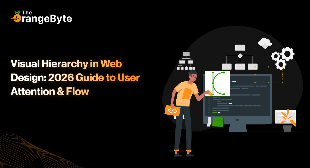
What Is Visual Hierarchy?
Visual hierarchy is a deliberate structure and ranking of the items on a webpage, and it is important to make sure that the consumer’s eye flows through a webpage as smoothly as possible.
It is about establishing a proper hierarchy of importance so that the most important content comes out and the secondary or supporting content reinforces it.
Good visual hierarchy helps to decrease brain load, avoids confusion and users of the product do not need to snake hunt in search of the desired information.
Some factors that can affect visual hierarchy are:
- Size and Scale: Objects of larger size will get attention first, hence they would be better suited in headlines or main calls to action.
- Color and Contrast: The color is naturally drawn, and it is easier to see the important elements as it is a bright color or a contrasting color.
- Typography and Font Weight: The headings, subheadings, and body content can be differentiated with bold fonts, big fonts, and special fonts.
- Spacing and Alignment: The appropriate use of white space and alignment enhances the readability and organizes the visual layout of the content.
- Positioning and Layout: This is where the location on the page determines the sequence in which things are observed. One of the most attended elements may be the ones at the top-left, or the centre, of the page.
Why Visual Hierarchy Matters in 2026
There is little attention paid to the numerous options of the modern web user. Visual hierarchy is important in that:
- Directing Focus: A good hierarchy makes users view what is most important to them first, whether it is a headline, product feature or call to action.
- Improving Readability: There is a recognizable hierarchy, and the user can easily scan the page and extract the information without being overwhelmed.
- Simplifying Navigation: By including menus, buttons and links as the top priority, your user can easily navigate your site.
- Focusing Conversions: By focusing attention on conversion features such as sign-up buttons, promo offers, or buy options, you can drive engagement and conversion.
- Lessening Bounce Rates: Unclear layouts anger the users. A descriptive, visual site layout will hold users on your site.
Ultimately, a website without a well-thought-out hierarchy risks frustrating users, resulting in poor engagement and lost opportunities. This is why hiring a web development agency in Greenville, SC, for expert guidance and responsive website design services can make a significant difference.
Core Principles of Visual Hierarchy in 2026
1. Size and Scale
The most intuitive means to express the importance is size. Bigger things are those that are bound to attract attention. The visual appearance should be dominated by headlines, hero sections and major call-to-action buttons. One should have smaller fonts that are still readable as secondary text, like supporting text or minor details.
As an illustration, an e-commerce homepage may have a big hero section occupied by the product of the week, and other product recommendations are smaller in size below. This leads the users to see the highlight first.
2. Colur and Contrast
Color is not only appealing to the eye, but it is also a potent force in controlling how people act. The colurs with high contrast attract attention, whereas the duller colors are in the background.
The buttons, links, and notifications must be decorated with the use of complementary colurs or vivid hues, which will help the user to notice them instantly. An example of this is a bright orange Buy Now button on a neutral-colored page, which is immediately caught and, of course, clicks.
Subtle gradient, micro-shadows and overlayed transparency are other experiments that the designers play around with in 2026 to add depth and focus.
3. Typography and Text Styling
Typography conveys hierarchy quite easily. The relative importance of the content is indicated by the use of varying font sizes, weights and styles.
There should be a clear difference between headlines, subheadings and body text. Serif fonts have a sense of power, whereas the sans-serif fonts are contemporary and friendly. Also, the scannability of the content can be enhanced by the line spacing, kerning, and paragraph breaks, which will also improve its readability.
4. Spacing and Alignment
White space or negative space is not something empty; it is a strategic tool. Adequate separation between the items helps avoid clutter, allowing the users to see the difference between sections more easily and concentrate on what is important.
The use of alignment brings about the perception of order and directs the eye naturally in the content directions. Modular layouts and grids are often utilized to ensure consistency and permit creative design components.
5. Positioning and Layout
The location of elements within the page has a huge influence on the visibility. People tend to scan web pages in predictable sequences and usually in an F-pattern or Z-pattern.
Locating important content on these natural scanning lines will get maximum attention. Prime positioning should be taken by hero images, navigation bars and featured products because people should notice such objects first.
Asymmetric layouts, such as split screens or dynamic layouts, are popular in 2026 as a way to create visual interest and, at the same time, hierarchy.
Enhancing User Flow with Visual Hierarchy
The user experience involves more than isolated design principles. There should be a visual hierarchy that works together to ensure the users are led into the content in a natural manner. The following are the high-level strategies:
- Prioritize Content: Determine the main objectives of the page and make sure that those should be the visually dominating elements.
- Apply Grid Systems: Grids give order to the structure, and it becomes easier to arrange the material in a logical and aligned manner.
- Use Visual Cues: Arrows, icons, and directional cues can all help indicate to users what is important in a subtle way.
- Add Micro-Interactions: Hover effects, animated transitions or dynamic pop-ups can be used to get attention without being invasive.
- Make it Accessible: Be sure to use enough contrast, clear fonts and navigation to encourage everyone to interact with the site, including disabled users.
Visual Hierarchy in Practice: Examples for 2026
The new websites are expanding the boundaries of creativity and following the principles of hierarchy. Some examples include:
- Bold Typography: Bold fonts are used to draw attention to the headlines.
- Bright Colors: High-contrasting objects or gradient overlays will direct attention to significant content.
- Layered Layouts: Layered images, cards or sections provide depth, and draw the attention of the user.
- Animations & Micro-Interactions: Unobtrusive hover effects, motion and scroll-triggered animations guide the user to important parts intuitively.
- Storytelling Through Design: Linear visual storytelling, or layout, image, and text-based illustrations that take one on a narrative, are becoming more and more common.
These tendencies emphasize that there is a compromise between creativity and usability, and hierarchy may be dynamic, involving and user-driven.
Best Practices for Implementing Visual Hierarchy
- Coherence Within Pages: Use the same styles in headings, buttons and interactive features to ensure that the user is not confused.
- Test Designs with Users: A/B testing, heatmaps, and usability tests reveal how users actually interact with your layout.
- Mobile-First Approach: Hierarchy takes even greater concern on the small screens. Keep crucial aspects to the fore.
- Follow Trends: To be relevant, follow the current trends in design such as micro-interactions, scrolling immersion and minimalism.
- Accessibility Matters: Having a clear hierarchy is not only helpful in aesthetics but also in accessibility, which can make your site more inclusive and easy to use by everyone.
Conclusion
After all, in 2026, we will not be able to do without visual hierarchy. Websites that easily direct visitors through the information are more interactive, user-friendly and almost guarantee a visitor becoming a long-term customer.
Designers can use the wise use of size, color, typography, spacing and positioning to produce intuitive, aesthetically pleasing and highly functional websites.
A site without visual hierarchy could become confusing, frustrating and miss opportunities. The OrangeByte guides you through the concepts of visual hierarchy, which will turn your site into a beautiful, user-friendly, and result-driven visual experience.


